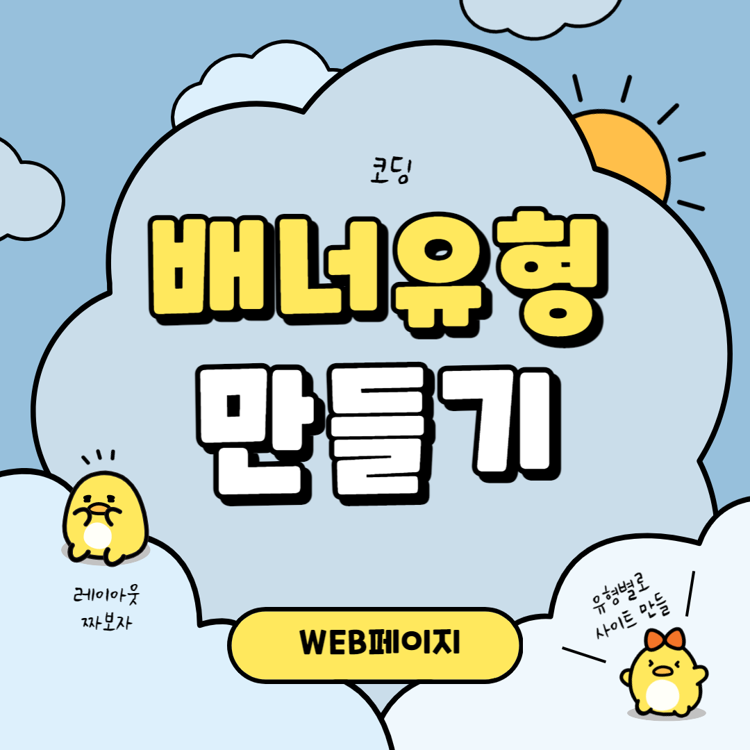
배너 유형 페이지 만들기
피그마에서 만든 디자인을 그대로 코딩해보도록 하겠습니다.
기본 CSS 리셋값 설정하기
CSS리셋 (CSS Reset)은 웹사이트의 스타일링을 일관되게 만들기 위해 사용되는 기술입니다. 초기 설정을 해두면 폰트라던지 마진, 패딩값이 먹혀서 편하겠죠??
/* reset */
* {
    margin: 0;
    padding: 0;
}
a {
    text-decoration: none;
}
h1, h2, h3, h4, h5, h6 {
    font-weight: normal;
}
img {
    vertical-align: top;
    width: 100%;
}
.blind {
    position:absolute;
    clip:rect(0 0 0 0);
    width:1px;
    height:1px;
    margin:-1px;
    overflow:hidden;
}
.mt10 {margin-top: 10px !important;}
.mt20 {margin-top: 20px !important;}
.mt30 {margin-top: 30px !important;}
.mt40 {margin-top: 40px !important;}
.mt50 {margin-top: 50px !important;}
.mt60 {margin-top: 60px !important;}
.mt70 {margin-top: 70px !important;}

.mb10 {margin-bottom: 10px !important;}
.mb20 {margin-bottom: 20px !important;}
.mb30 {margin-bottom: 30px !important;}
.mb40 {margin-bottom: 40px !important;}
.mb50 {margin-bottom: 50px !important;}
.mb60 {margin-bottom: 60px !important;}
.mb70 {margin-bottom: 70px !important;}
/* common */
.container {
    width: 1160px;
    margin: 0 auto;
    padding: 0 20px;
    /* background-color: rgba(0, 0, 0, 0.1); */
}
.nexon {
    font-family: 'NexonLv1Gothic';
    font-weight: 400;
}
.section {
    padding: 120px 0;
    text-align: center;
}
.section.center {
    text-align: center;
}
.section__small {
    font-size: 14px;
    border-radius: 50px;
    background-color: #ff4191;
    color: #fff;
    padding: 1px 23px;
    text-transform: uppercase;
    margin-bottom: 20px;
    display: inline-block;
}
.section__h2 {
    font-size: 50px;
    font-weight: 400;
    margin-bottom: 30px;
    line-height: 1;
}
.section__desc {
    font-size: 22px;
    color: #666;
    margin-bottom: 70px;
    font-weight: 300;
    line-height: 1.5;
}
배너 섹션 구성해주기
<body>
    <section class="banner__wrap">
        <h2 class="blind">배너</h2>
        <div class="banner__inner">
            <div class="banner">
                <div class="banner__info section nexon">
                    <h3>조향에 관한 유튜브</h3>
                    <p>다양한 조향에 관한 지식은<br>유튜브를 통해 더욱 자세히 확인할 수 있습니다.</p>
                    <address class="right"><a href="#">https://youtu.be/TLsRyJuJ04o</a></address>
                </div>
            </div>
        </div>
    </section>
</body>banner__wrap을 만들어준 후, 웹표준에 맞게 h2 태그를 만들어 이름을 blind라고 지어줍니다.
그리고 banner__inner에 banner, 그 안에 banner__info를 만들어줍니다. 제목과 내용, 그리고 유튜브 주소를 넣어줍니다.
그리고 기본 폰트와 가운데로 와야하기 때문에 section과 nexon을 적어줍니다.
배너 구역 CSS 설정해주기
/* banner__wrap */
.banner__inner {
    color: #fff;
}
.banner__inner .banner {
    height: 500px;
    background-image: url(../asset/img/BANNER-TYPE01-min.jpg);
    background-size: cover;
    background-repeat: no-repeat;
    background-position: center;
    position: relative;
    z-index: 1;
}
.banner__inner h3 {
    font-size: 45px;
    font-weight: 400;
    padding-bottom: 50px;
}
.banner__inner p {
    font-size: 16px;
    font-weight: 300;
    line-height: 1.5;
    padding-bottom: 100px;
}
.banner__inner .right {
    text-align: center;
    font-style: normal;
    line-height: 1.6;
    font-size: 14px;
}
.banner__inner .right a{
    color: #fff;
    text-decoration: underline;
}

@media only screen and (-webkit-min-device-pixel-ratio: 2),
    only screen and (min-device-pixel-ratio: 2),
    only screen and (min-resolution: 2dppx) {
        .slider__inner .slider {
            background-image: url(../asset/img/BANNER-TYPE01@2x-min.jpg);
        }
}banner 부분에 height값을 지정해주고, background-image를 이용해 뒤에 이미지를 넣어줍니다.
backgroundsize를 cover로 해주고, repeat를 no-repeat로 설정해주고 position을 center로 지정해줍니다.
그리고 position을 relative로 설정해주고 z-index값을 1로 설정해줍니다.
각각 banner__info에 있는 정보들의 폰트 사이즈나 컬러들을 설정해줍니다.
CSS 사전
| text-align | 속성은 텍스트 정렬 방식을 설정합니다. |
|
vertical-align
|
인라인 요소의 수직 정렬 방법을 설정하는 속성입니다. |
| justify-content | CSS Flexbox 레이아웃에서 주 축(main axis)을 따라 플렉스 아이템(flex item)을 정렬하는 속성입니다. |
|
background-repeat
|
배경 이미지의 반복 여부를 지정하는 속성입니다. |
| background-position | 배경 이미지의 위치를 지정하는 속성입니다. |
|
background-image
|
요소의 배경 이미지를 설정하는 속성입니다. |
|
display
|
요소의 표시 방법(display method)을 설정하는 속성입니다. |
|
line-height
|
줄 간격을 지정하는 속성입니다. |
|
z-index
|
위치 지정 요소와, 그 자손 또는 하위 플렉스 아이템의 Z축 순서를 지정합니다. |
|
position
|
요소의 위치를 지정하는 속성입니다. |
|
position: relative
|
요소의 위치를 변경할 때 사용되며, 다른 요소와의 상대적인 위치를 정의합니다. position 속성에 relative를 지정하면 해당 요소는 원래 위치를 기준으로 이동하게 되며, 다른 요소와 겹치지 않도록 공간을 확보할 수 있습니다. |
|
position: absolute
|
요소를 페이지의 상대적이거나 절대적인 위치로 이동시킬 때 사용됩니다. position 속성에 absolute를 지정하면, 해당 요소는 부모 요소의 위치를 기준으로 이동하며, 다른 요소들과 겹칠 수 있습니다. |
완성된 페이지와 코드
다른 유형의 페이지 보러가기
카드 유형 : https://duektmf34.tistory.com/32
이미지 유형 : https://duektmf34.tistory.com/37
이미지텍스트 유형 : https://duektmf34.tistory.com/42
슬라이드 유형 : https://duektmf34.tistory.com/43
텍스트 유형 : https://duektmf34.tistory.com/48
푸터 유형 : https://duektmf34.tistory.com/53
배너 유형 페이지 만들기
피그마에서 만든 디자인을 그대로 코딩해보도록 하겠습니다.
기본 CSS 리셋값 설정하기
CSS리셋 (CSS Reset)은 웹사이트의 스타일링을 일관되게 만들기 위해 사용되는 기술입니다. 초기 설정을 해두면 폰트라던지 마진, 패딩값이 먹혀서 편하겠죠??
/* reset */
* {
    margin: 0;
    padding: 0;
}
a {
    text-decoration: none;
}
h1, h2, h3, h4, h5, h6 {
    font-weight: normal;
}
img {
    vertical-align: top;
    width: 100%;
}
.blind {
    position:absolute;
    clip:rect(0 0 0 0);
    width:1px;
    height:1px;
    margin:-1px;
    overflow:hidden;
}
.mt10 {margin-top: 10px !important;}
.mt20 {margin-top: 20px !important;}
.mt30 {margin-top: 30px !important;}
.mt40 {margin-top: 40px !important;}
.mt50 {margin-top: 50px !important;}
.mt60 {margin-top: 60px !important;}
.mt70 {margin-top: 70px !important;}

.mb10 {margin-bottom: 10px !important;}
.mb20 {margin-bottom: 20px !important;}
.mb30 {margin-bottom: 30px !important;}
.mb40 {margin-bottom: 40px !important;}
.mb50 {margin-bottom: 50px !important;}
.mb60 {margin-bottom: 60px !important;}
.mb70 {margin-bottom: 70px !important;}
/* common */
.container {
    width: 1160px;
    margin: 0 auto;
    padding: 0 20px;
    /* background-color: rgba(0, 0, 0, 0.1); */
}
.nexon {
    font-family: 'NexonLv1Gothic';
    font-weight: 400;
}
.section {
    padding: 120px 0;
    text-align: center;
}
.section.center {
    text-align: center;
}
.section__small {
    font-size: 14px;
    border-radius: 50px;
    background-color: #ff4191;
    color: #fff;
    padding: 1px 23px;
    text-transform: uppercase;
    margin-bottom: 20px;
    display: inline-block;
}
.section__h2 {
    font-size: 50px;
    font-weight: 400;
    margin-bottom: 30px;
    line-height: 1;
}
.section__desc {
    font-size: 22px;
    color: #666;
    margin-bottom: 70px;
    font-weight: 300;
    line-height: 1.5;
}
배너 섹션 구성해주기
<body>
    <section class="banner__wrap">
        <h2 class="blind">배너</h2>
        <div class="banner__inner">
            <div class="banner">
                <div class="banner__info section nexon">
                    <h3>조향에 관한 유튜브</h3>
                    <p>다양한 조향에 관한 지식은<br>유튜브를 통해 더욱 자세히 확인할 수 있습니다.</p>
                    <address class="right"><a href="#">https://youtu.be/TLsRyJuJ04o</a></address>
                </div>
            </div>
        </div>
    </section>
</body>
banner__wrap을 만들어준 후, 웹표준에 맞게 h2 태그를 만들어 이름을 blind라고 지어줍니다.
그리고 banner__inner에 banner, 그 안에 banner__info를 만들어줍니다. 제목과 내용, 그리고 유튜브 주소를 넣어줍니다.
그리고 기본 폰트와 가운데로 와야하기 때문에 section과 nexon을 적어줍니다.
배너 구역 CSS 설정해주기
/* banner__wrap */
.banner__inner {
    color: #fff;
}
.banner__inner .banner {
    height: 500px;
    background-image: url(../asset/img/BANNER-TYPE01-min.jpg);
    background-size: cover;
    background-repeat: no-repeat;
    background-position: center;
    position: relative;
    z-index: 1;
}
.banner__inner h3 {
    font-size: 45px;
    font-weight: 400;
    padding-bottom: 50px;
}
.banner__inner p {
    font-size: 16px;
    font-weight: 300;
    line-height: 1.5;
    padding-bottom: 100px;
}
.banner__inner .right {
    text-align: center;
    font-style: normal;
    line-height: 1.6;
    font-size: 14px;
}
.banner__inner .right a{
    color: #fff;
    text-decoration: underline;
}

@media only screen and (-webkit-min-device-pixel-ratio: 2),
    only screen and (min-device-pixel-ratio: 2),
    only screen and (min-resolution: 2dppx) {
        .slider__inner .slider {
            background-image: url(../asset/img/BANNER-TYPE01@2x-min.jpg);
        }
    }
banner 부분에 height값을 지정해주고, background-image를 이용해 뒤에 이미지를 넣어줍니다.
backgroundsize를 cover로 해주고, repeat를 no-repeat로 설정해주고 position을 center로 지정해줍니다.
그리고 position을 relative로 설정해주고 z-index값을 1로 설정해줍니다.
각각 banner__info에 있는 정보들의 폰트 사이즈나 컬러들을 설정해줍니다.
CSS 사전
| text-align | 속성은 텍스트 정렬 방식을 설정합니다. |
|
vertical-align
|
인라인 요소의 수직 정렬 방법을 설정하는 속성입니다. |
| justify-content | CSS Flexbox 레이아웃에서 주 축(main axis)을 따라 플렉스 아이템(flex item)을 정렬하는 속성입니다. |
|
background-repeat
|
배경 이미지의 반복 여부를 지정하는 속성입니다. |
| background-position | 배경 이미지의 위치를 지정하는 속성입니다. |
|
background-image
|
요소의 배경 이미지를 설정하는 속성입니다. |
|
display
|
요소의 표시 방법(display method)을 설정하는 속성입니다. |
|
line-height
|
줄 간격을 지정하는 속성입니다. |
|
z-index
|
위치 지정 요소와, 그 자손 또는 하위 플렉스 아이템의 Z축 순서를 지정합니다. |
|
position
|
요소의 위치를 지정하는 속성입니다. |
|
position: relative
|
요소의 위치를 변경할 때 사용되며, 다른 요소와의 상대적인 위치를 정의합니다. position 속성에 relative를 지정하면 해당 요소는 원래 위치를 기준으로 이동하게 되며, 다른 요소와 겹치지 않도록 공간을 확보할 수 있습니다. |
|
position: absolute
|
요소를 페이지의 상대적이거나 절대적인 위치로 이동시킬 때 사용됩니다. position 속성에 absolute를 지정하면, 해당 요소는 부모 요소의 위치를 기준으로 이동하며, 다른 요소들과 겹칠 수 있습니다. |
완성된 페이지와 코드
다른 유형의 페이지 보러가기
카드 유형 : https://duektmf34.tistory.com/32
이미지 유형 : https://duektmf34.tistory.com/37
이미지텍스트 유형 : https://duektmf34.tistory.com/42
슬라이드 유형 : https://duektmf34.tistory.com/43
텍스트 유형 : https://duektmf34.tistory.com/48
푸터 유형 : https://duektmf34.tistory.com/53